In a previous post, we looked at how to create dynamic lists of symbols and charts in Grafana. While this is great to watch individual charts for different symbols, sometimes you may want to merge all the charts together to compare changes in a visual manner.
One of our community members had been struggling with this over time and had
tried various approaches. As a result, we created an implementation of the
first_value() window function which easily solves the underlying issues with
these types of visualizations. This article explains how it's applied.
As a reminder, if you like to follow along with your own instance of QuestDB and Grafana, follow our tutorial or visit the Grafana docs for more information.
This data in particular was pulled using the cryptofeed library. See this tutorial to set it up quickly and start ingesting real trades from the largest crypto exchanges directly into QuestDB.
The simple approach
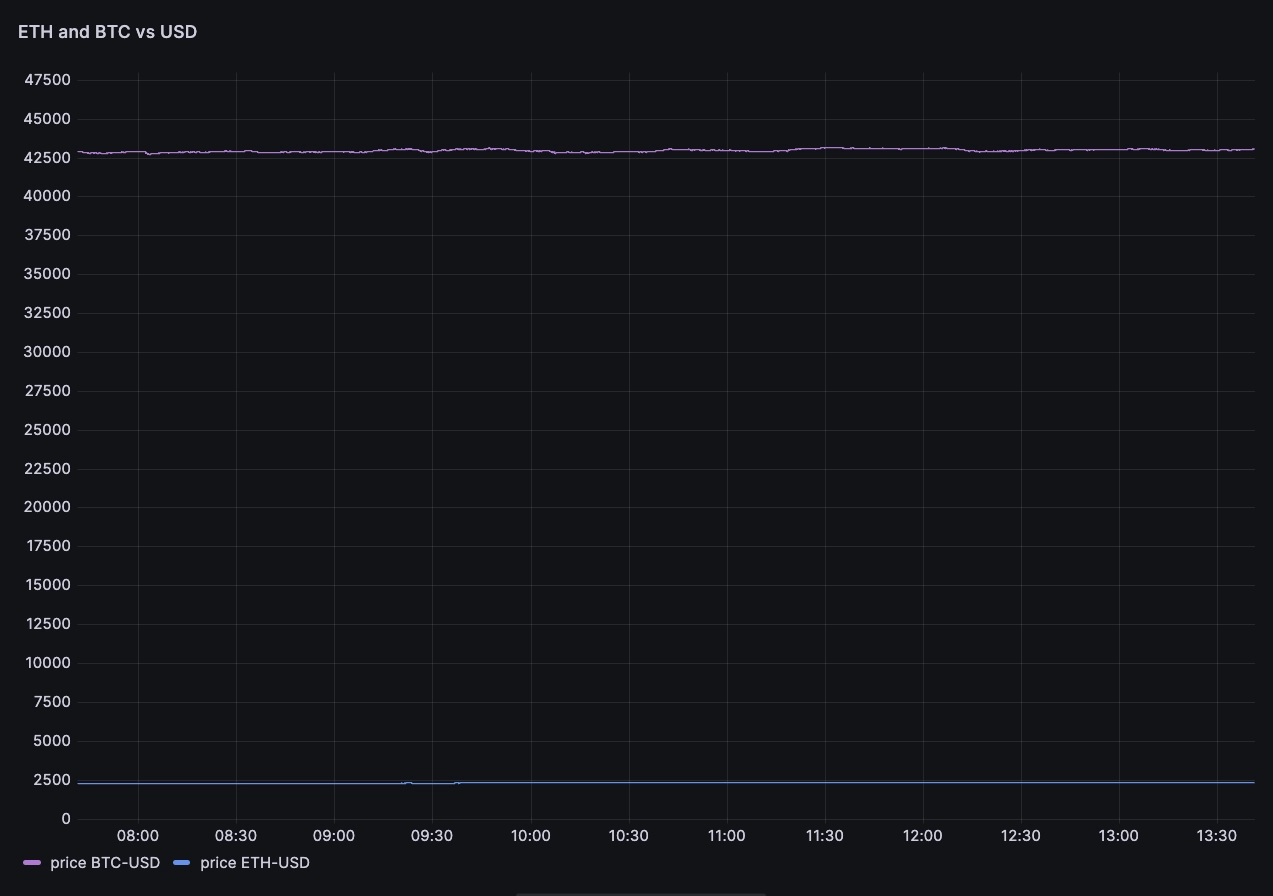
Unfortunately … does not work. If we were to create a chart with the prices of ETH-USD and BTC-USD, then we would end up with something like this…
SELECT
  timestamp,
  symbol,
  price
FROM
  trades
WHERE
  $__timeFilter(timestamp)
  AND symbol IN ('ETH-USD', 'BTC-USD')

The chart uses the partition by values Grafana transformation to generate two
series. As you can see, the price of 'BTC-USD' is roughly 17x greater than
'ETH-USD'. On the same scale, the time series are hard to compare. If we wanted
to look at volatility or another moving metric, we'd need lots of patience and a
very strong magnifying glass.
Overriding the axis
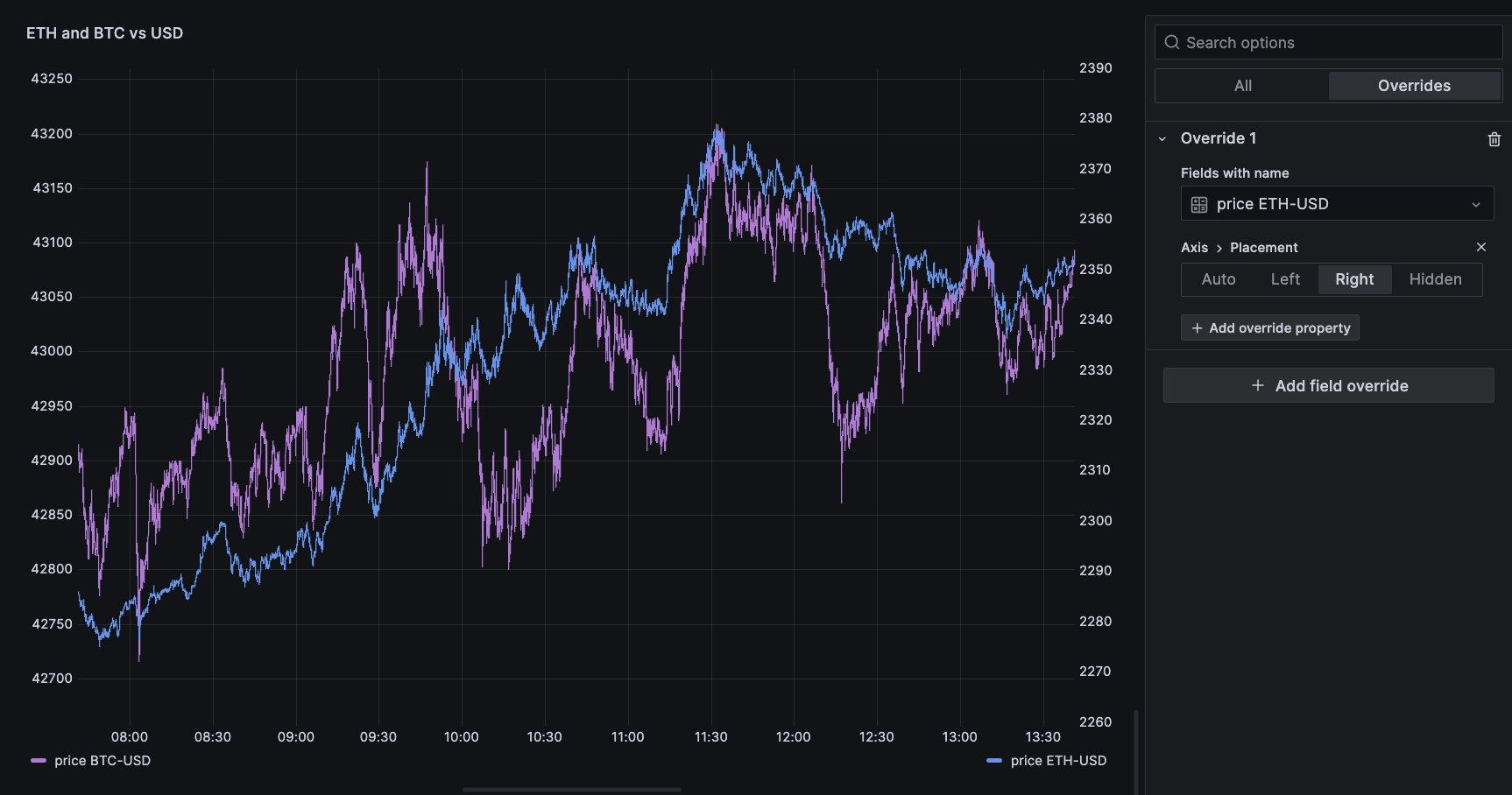
One solution to create comparable data is to assign each series to its own axis.
We can achieve this with an override on the price ETH-USD series, setting
the axis placement property to the right:

While it makes it easier to see how each series is moving, we are missing any sense of scale because both axes scales remain independent. As a result, the two series do not start at the same point. It is hard to tell if one is moving relatively more than the other in a given direction. In addition, this can quickly become messy if we need to compare more than two series.
The overkill
Before window functions, our community member found a trick to achieve what they wanted. It consisted of using sub-queries to do the following…
- Get the first value of the series for each symbol
first - Get all the values for each symbol for the time period
current - Cross join both of the above based on symbol
- Calculate the percentage change for all symbols, for example
current/first * 100
While this achieved the desired results, it was a heavy query to write and run
due to the heavy joins and multiple sub-queries. Over large time periods and
with many symbols, this could result in too many data points for Grafana
dashboards and thus necessitate the use of
SAMPLE BY to further reduce its time frame.
While adequate, it further complicates the query. We can do better.
The first_value() window function
The first_value() window
function returns the first value of a metric over a time window. With it, we can
do two things:
- Easily access the value as of the first timestamp of the series
- Use the resultant value as a normalizing factor to compare the evolution of the series
WITH series AS (
  SELECT
    timestamp,
    symbol,
    price,
    first_value(price) OVER (
      PARTITION BY symbol
      ROWS BETWEEN UNBOUNDED PRECEDING AND CURRENT ROW
    )
  FROM
    trades
  WHERE
    $__timeFilter(timestamp)
    AND symbol IN ('ETH-USD', 'BTC-USD')
)

SELECT
  timestamp,
  symbol,
  price / first_value AS perf
FROM
  series

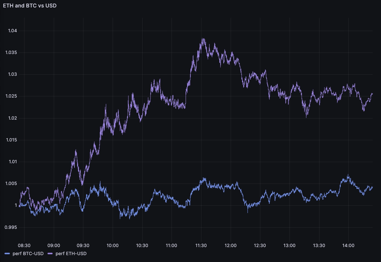
Our new approach revealed that our earlier twin-Y axis chart was misleading. It showed us that ETH and BTC moved up by roughly the same relative amount. However, with the normalized chart above we can see everything in the same scale. ETH significantly outperformed BTC over the time interval!
This sort of visualization is quite powerful as it can synthesize market activity across many instruments in a more simple chart. But we can do even better:
WITH data AS (
  SELECT
    timestamp,
    symbol,
    price,
    first_value(price) OVER (
      PARTITION BY symbol
      ROWS BETWEEN UNBOUNDED PRECEDING AND CURRENT ROW
    )
  FROM
    trades
  WHERE
    $__timeFilter(timestamp)
)

SELECT
  timestamp,
  symbol,
  price / first_value AS perf
FROM
  data
Let's unpack the differences.
In the prior query, the expression named series filters the trades table to
include only rows where the symbol is either 'ETH-USD' or 'BTC-USD' and the
timestamp satisfies the condition specified by $__timeFilter(timestamp).
In our new query, the expression named data filters the trades table to
include only rows where the timestamp satisfies the condition specified by
$__timeFilter(timestamp). It does not filter based on the symbol.
The prior query will only calculate and return performance (perf) for
'ETH-USD' and 'BTC-USD', while our new query will calculate and return
performance (perf) for all symbols in the trades table that satisfy the time
filter condition.
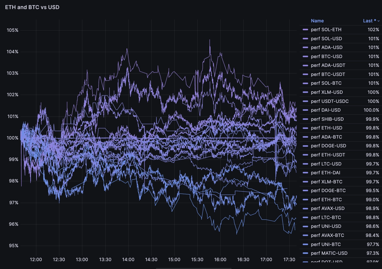
Now, we can configure Grafana as follows:
Legend mode= TableLegend placement= RightLegend values= Last
We then end up with the following chart summarizing how each crypto pair performed in relative terms in the last few hours:

The chart makes it pretty apparent that SOL pairs are up, while MATIC and
DOT are strongly down. While it's easy to get this by computing the ratio of
first and last prices over the interval, having a full time series helps
understand what's going on with higher fidelity. We can ask: Did the pair jump
up quickly, did it trend upwards, and so on.
Next steps
Window functions greatly simplify query complexity and performance. Perhaps most
important: It leads to higher quality analysis. While we've made progress in
making it easier to compare values across time, our approach still requires a
sub-query. QuestDB is considering a separate function such as
normalised_value(field, base) where base is the scale. For example: Does the
series start at 100, at 1, or somewhere else.
If you're interested in that functionality or have any other feedback, please drop by our open source repository or Community Forum and let us know.
Interested in more Grafana tutorials?
Check these out:
- Working with Grafana Map Markers
- Fluid real-time dashboards with QuestDB and Grafana
- Build your own resource monitor
- Tracking sea faring ships with AIS data and Grafana
- Visualizing real-time NYC cab data and geodata
- Increase Grafana refresh rate frequency
- Or checkout our Grafana blog tag